That being said, I challenged myself. I challenged myself to use Helvetica in my work and see if I can appreciate it. I stepped out of my boundaries, my comfort zone by using a font I usually just shrug to. I took this into consideration with the studying of Jan Tschichold, and his aesthetic.

Finding a balance between collage and clean/cut font. Of course when you look at my previous works, you find montages with heavy imagery, shapes and found phrases. My challenge to myself was to cut down the heavy imagery and incorporate the clean/cut font - Helvetica.
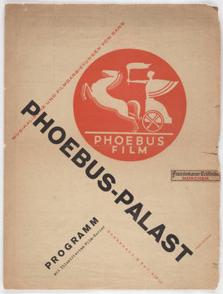
Of course this was a slow process, I am not used to using only a few images in my work, so the first step wasn't simplistic at all:


But do I like it? Yes...I do. But this wasn't challenging enough. It was a step. Through much deletion and forcing myself to go easy on imagery I came up with new designs:


These images I am very pleased with. I felt I was still able to keep the geometric shapes you often see in my work and incorporate that with a simplistic aesthetic...incorporating Helvetica.
No comments:
Post a Comment