Tuesday 29 November 2011

Beyond the companion

I received an email from Lothian buses saying that they cannot put my publications on their buses due to a contract they currently have with Metro newspaper. This wasn't solely bad news, in fact after much thinking and head banging against my desk for new ideas - they finally popped up! It was sort of a release, a bit of freedom. I can now design without having thinking I will have to 'sell' this work/idea to a company. I can finally design for myself and my audience!

For context, we have to create an event where we receive feedback on our work from our target audience. I threw away the idea of the Lothian companion and came up with these 'gifts' to give to commuters. These gifts continue with activities, quotes and newly....hand sanitizer.


I want people to interact with things outside what they're used to! Put down their book and pick up with gift that has a page for them to pass a note to a neighbour. Or a page that is just to wrap up their up, because we all know buses need to be cleaner. Or perhaps a page to draw. Why not? 

I've been forced to think about other ways to communicate my message, I am always influenced by Stefan Sagmeister and truth be told...every piece of work he creates. He always goes beyond the norm and of course there is a large part of me that's truly jealous of his mind. In his work 'my life' (trying to look good limits my life, he creates words that aren't on printed media, aren't posters but could be found in everyday objects.


Though my event is still on printed materials, I know this to be the next step to exploring other areas of communicating my message. Now to get my hands dirty...


Monday 28 November 2011

Messages of Joy

I started exploring other ways to reach the minds of bus commuters - things that they can enjoy whilst waiting for their bus. In continuation of my Helvetica explorations, I created cards and envelopes for readers to find on bus stops. These cards include activities, a story, and a simple message of SMILE.


I took the helvetica explorations images and added text to the back.


 The text varied. One card had an exercise routine, yet another activity to do while on the bus.
The next a story about LA, encouraging bus commuters to communicate with one another.
And the third encouraging the commuter to take notice of his/her surroundings while on the bus.
In addition, another 'card' was created. This one being slightly more interactive. This one relied on the mood of the commuter, truth be told I can't assume how everyone is feeling so it encourages one to address their mood and then find some possible useful activity. On the front, you find your mood, turn the card over and find your activity - each activity matching the mood of the commuter.


In exploring 'joy,' I came across the idea of these oh so random cards. They simply have a goofy photo on front with the word SMILE on the back. My intention for these cards are to be found in either the envelopes or perhaps left on the bus. I picture someone sitting there and seeing the photo of the crazy chicken and not help but chuckle. Upon showing the images to friends and classmates, I saw that they got a giggle...now here's to hoping the same effect happens with bus commuters.


To spread cheer, to spread awareness.


Tuesday 22 November 2011

I have an inkling...

2 colds/flus, 1 food poisoning, 1 sprained knee, 1 laptop crash has all equaled one hell of a semester. Perhaps I'm getting it all out this semester? That it's nothing but clear blue skies from here on out...here's to hoping!

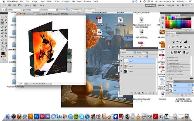
Moving on, designing my pitch for the ECA Fashion Show was a great experience. The idea definitely progressed and developed much throughout the passed month - but the concept remained the same. The concept sprouted through the idea of fluidity found in ink and water, how fashion shows must remain fluid. It's one piece after another, it must continue and keep moving. There are no pauses, there is no stopping, keep going, keep moving, keep progressing.

From this I played around with photographing ink in water. I found it to be beautiful in the way that I had no control in the shapes made and created. It was a challenge I enjoyed.


Through this, my first design developed. High contrast between the bright orange and strong black. My idea for ticket would have been a postable 'perfume/ink' like liquid. Continuing with the concept of fluidity. After critique of this work, I was told that perhaps the ink looked a bit like 'bodily fluid' or something that could be found within one's body...something that perhaps isn't so attractive.


My next design consisted of changing the bright appearance of the orange ink and masking it through the black ink shape.


After I finished this revision, I had realized that perhaps Halloween was on my mind too much...seeing the colours and also how the 'Rorschach' mirrored effect made it look somewhat like a skull. Sinister? Perhaps. Again, the criticism of this revision was that it still reminded others of bodily fluids. At this point, I still didn't see it. After looking at it extensively, it appeared! From here on out, I couldn't look at this image without thinking, 'semen, semen, semen, semen...'

At this point I knew I still wanted to continue with the concept of ink in water and fluidity...but how can I do that without creating a design that looks like..well you get the point by now.


Having just read up on Gustav Klimt, my new design came alive.


I created a new image made from only 3 images of ink in water. I took geometric shapes from these images to create a new image. I fell in love with the contrast of ink being fluid and smooth, and these geometric shapes having hard edges, it was an ironic marriage formed. I started working on this image and worked the whole night through, it was after this night that flu #2 attacked me, I guess that's what lack of sleep does.

Details of the dress/body being made ^

Final design of the poster ^

Final design of the inside spread for the brochure, conveying a mirrored 'Rorschach' like concept. ^


And just as a sidenote: This should have been my first sign that my laptop was about to give way - Every time I hit save, this is what my image looked like as it was saving. Step one in how to give a graphic designer a heart attack...


Monday 21 November 2011

Oh Helvetica...

It is no secret that I'm not a fan of Helvetica. My not being a fan of it isn't nearly in the same category of Papyrus or Comic Sans - being that I don't think it's obnoxious. But rather I know the history of Helvetica, I know its influence and because of that there has always been a stubborn side of me thinking, "I DON'T HAVE TO CONFORM!" or "I CAN GET BY WITHOUT IT!" Giving fonts a personality I thought, "Why not give the others a chance to shine?" Almost like Helvetica is the big kid on campus, and instead I should give attention to the nerdy kids in the corner.

That being said, I challenged myself. I challenged myself to use Helvetica in my work and see if I can appreciate it. I stepped out of my boundaries, my comfort zone by using a font I usually just shrug to. I took this into consideration with the studying of Jan Tschichold, and his aesthetic.


 Finding a balance between collage and clean/cut font. Of course when you look at my previous works, you find montages with heavy imagery, shapes and found phrases. My challenge to myself was to cut down the heavy imagery and incorporate the clean/cut font - Helvetica.

Of course this was a slow process, I am not used to using only a few images in my work, so the first step wasn't simplistic at all: 


But do I like it? Yes...I do. But this wasn't challenging enough. It was a step. Through much deletion and forcing myself to go easy on imagery I came up with new designs:


These images I am very pleased with. I felt I was still able to keep the geometric shapes you often see in my work and incorporate that with a simplistic aesthetic...incorporating Helvetica.

Friday 18 November 2011

The Death of the Red Car System

It is of little known fact that the movie 'Who Framed Roger Rabbit?' holds a bit of truth to Los Angeles history. No, not about the fall of cartoons but rather the fall of the Red Car system (the cable car) and the rise of freeways and dependence on cars.


Nowadays when you picture Los Angeles transport, you think smog, traffic, millions of cars, and really all in all just grumpy miserable people commuting to work. But in the 1920s, the Red Car system in LA was the largest electric railway system in the world. Into the 1930s, there was such a large influence from the automotive companies, that large 'motor-ways' were built. What we know now as freeways. When traffic congestion increased, the solution at the time was to build even more freeways, with more lanes. Sadly, the cable car started seeing its death.


Throughout the year, there were many attempts to expand mass public transit but none of these ideas truly stuck around. It wasn't until the 1990s, that plans were made for LA to delve into the world of Subways. Currently there are only 4 underground lines, quite a sad number in comparison to the size/population of LA but it is slowly...very slowly becoming more popular.


Today it is best to compare Los Angelinos love of their cars to that of Americans and their attachments to their guns. 'You can't take my gun away!'

'You can't take my car away!'

I took a break from coming up with designs to make bus commuters happy, and decided to head back to the origin of my reasons for my subject. When stumped, head back to the beginning right? I've been trying to push myself out of my element so much, that I'm now in that uncomfortable phase. That uncomfortable era of 'What is my aesthetic? Where has my personal design style gone?' (I just quivered using the word style. Sagmeister has scarred me forever! In a good way of course). When diving into my typography explorations, I have picked up a vintage aesthetic. I was challenged to get away from this aesthetic, being that it is quite popular at the moment. Of course, I don't want to be a follower as a designer, I want to be a leader - how nice it would be to be ground breaking.

But when you look at my previous work, it definitely has a vintage effect to it.
www.behance.net/jocelynk/frame

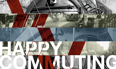
What I have created thus far in this new exploration is combine these random vintage/original images with new type. I know this isn't quite ground breaking in the design world in general, but it is ground breaking personally for my own work. I'm going back to the beginning, the origin of my studies and I'm combining it with the modern world.

My works in progress: "Smile. You have public transportation."


Smile that you have public transportation. Smile that you don't have to sit in traffic everyday, that government and large automobile industries haven't forced you to purchase a car. Corporations haven't forced you to sit alone in your vehicle, making no connection to others. Rather companies are giving you the freedom to sit and interact with others. Relax, let the driver take control. You'll get to your destination.

Monday 7 November 2011

No guts, no glory

My challenge is to go beyond the media I'm used to creating. I know how to create printed material, I know how to communicate messages through any printed media.


But take away my printer, my laptop and I'm lost, it's like throwing someone into the deep end of a swimming pool - with weights around their ankles. Good luck!

To go beyond the printed world, the printed companion. How do you reach others? There's performance, there's drama. If I want to influence the minds of the average commuter, I have to branch out beyond the passive printed format. Does this scare me? Of course it does, I am no performer. I would much rather reach the minds of the average commuter by hiding behind my work, but really - no guts, no glory.


To change topics: Now let's focus on what has been my inspiration as of lately. I swooned over the typography found in Lacoste Legends, it's newspaper and it's beautiful. Stunning type. It's artistic yet draws your eye in, makes you want to look closer.


 http://www.behance.net/gallery/Lacoste-Legends/1432521

To make the ordinary 'less ordinary,' I asked for some inspiration from my sister who happens to be a photography teacher, and therefore has a bit more insight into similar photographers. Her recommendations: Garry Winogrand, Stephen Shore (Uncommon Places) and Robert Frank
(The Americans.

Garry Winogrand did a series called Women are Beautiful. These are simple images capturing the average woman in the street, I feel they are stunning to the eye. These women aren't posing, they're captured in their everyday life and I smile because of it. They are beautiful:


Stephen Shore:


Robert Frank, The Americans: Of course I would swoon for these. It captures the essence of that time, that era. I swoon for the simple everyday beauty, now how do I get others to do the same? How do I do like them, capture the beauty and express the beauty?