Tuesday, 14 February 2012

Pause. Re-examine.


We love our space. We love isolation, we don't love the random elbow rub from sitting on a bus. Eye contact is usually prohibited. I came upon this product design, it is extremely creative. I do enjoy the playfulness behind the idea, but of course the meaning for this design is somewhat uneasy.


 http://www.behance.net/gallery/aria/948567

In essence, this is the exact opposite of my subject. Encourage isolation. The message is the same of encouraging those to find joy in public transport, but by complete opposite methods as my own.


While listening to Spotify the other day, an advert for Audible kept playing. Audible is from Amazon, it is an application you can download to your phone, and then download audio books for listening purposes. This particular advert speaks of the joy and peace you find when you put your headphones on and get lost in Audible during your morning commute. Encouraging you to cut off from the rest of the world and surroundings.

It is no secret that I'm not a fan of Amazon. Their main goal it seems is to promote the death of printed books my any means, whether it be through the kindle or through audible. Since they have become publishers on their own, they are able to completely bypass the printed editions of books, encouraging new means of 'reading.'

What these products essentially are doing is creating the environment one has in a car during their commute and transforming that to public transport. Isolation, withdrawal, privacy, reclusion. No opportunities for interaction, for conversation, for new experiences. Sit on your own, don't look up.

Friday, 10 February 2012

Go big or go home right?

That's the American way. We're not used to doing things on a small term basis, for proof just take a look at our cars, bathrooms, and roads. Even our plates of food.

I have a large idea for my degree show, whether it will be possible or not is still up in the air. But if I shoot high, aim for a large idea, I can always cut back if it ends up being out of reach. Better than working from little and trying to add more ideas.

Bus shelters are disgusting. They are cold and uninviting. My goal is to take that idea and 'reinvent' it to something welcoming and loveable. This is directly tied to finding joy in public transport as well, make something that is old and dull and exhibit in a positive light. Finding joys in what would normally be ignored.

There are many examples of bus shelter art. Whether it's an aesthetically pleasing design:


http://www.behance.net/gallery/City-of-Moscow-Bus-Shelter-Design/3072493

Or whether it's designs that are a bit more playful:


 http://www.behance.net/gallery/University-of-Idaho-bus-shelter/392761


IKEA has also dived into the creative bus shelter world for advertising purposes:


It's a large idea: getting a hold of a bus shelter, perhaps one that is not so used and grotesque, and incorporating my artwork in and around the bus. Clearly, it would be too simple to just attach my posters to the windowed sections - but it's a simple mock up.
I do know that I want my exhibit to be interactive, I don't want it to simply be a display of work that people walk by and only look at. My subject is to encourage interaction on public transport, so why would I create an exhibit that doesn't possess the same quality?

Create interaction, peace, joy, smiles, enlightenment.

Thursday, 2 February 2012

Happiness is a Warm Cushion

 It's rare to come across random acts of kindness. My classmate sent me this link:
 http://imprint.printmag.com/daily-heller/happiness-is-a-warm-cushion/

I am quite impressed and amazed by the minds of graphic design students Lizzy Showman and Kathleen Fitzgerald. They created bus seat cushions for NYC bus drivers on the M15 line. Every bus driver.


As commuters, we rarely think of the patience required of bus drivers. People aren't too cheery on their commute, we're grumpy, we're tired - we're thinking about how warm our bed was just 30 minutes ago. But one person has to deal with the our bitterness, one person absorbs the weight of everyone's frustration and continues to do their job - the driver.

Smiles are contagious, happiness spreads. As designers, we have the power to spread joy through these simple little movements.

Tuesday, 24 January 2012

Joy in Movement

The theme/title of my degree show came to mind while riding the bus the other day: Joy in Movement.

I was sitting in my favorite seat, looking over old photographs in my phone. I came upon one from my trip back to Los Angeles in summer 2011:


Traffic, I do not miss you. Sitting in traffic alone, you suffer an isolating feeling. Yes you are surrounded by people of like minds, but you're separated by white lines, heavy metals weighing up to 2 metric tons, and personalized music that allows you to stay in your own world. It's rare to make eye contact with another, or even a smile.

It is even more worrying when one steps onto a busy Tube train, and the isolation continues. You are touching others, you are right next to many people yet it still feels as though people are dividing themselves with white lines and 2 metric ton boxes. How sad it has become that if you get a cheerful smile from a stranger once, that is out of the norm.

In the opening scene of Crash - Don Cheadle's character is quoted saying,
 "It's the sense of touch. In any real city, you walk, you know? You brush past people, people bump into you. In L.A., nobody touches you. We're always behind this metal and glass. I think we miss that touch so much, that we crash into each other, just so we can feel something."

 I feel now that this is lack of human interaction has spread widely to most large cities. With new technology of iphones, ipads, kindles, mp3 players - it has become easier to ignore those around you and get distracted with the fun toy in hand.

Now more than ever is the time to raise attention to SMILE. JOY. BLISS. HAPPY. in public transport. To create Joy in Movement.


Look up. Smile.


Sunday, 11 December 2011

Unfinished projects

Of course it's the end of the semester and I feel it's ironic that this is when most ideas pop into my head. Why couldn't these have shown up a bit earlier in the semester? But moving on, here are ideas in my mind and now on here but are not created YET. Yet being the most important word. Truth is, time ran out for this semester's deadline. Though they're not created yet, they're still in my mind with an intention of exploring and creating.

First project targeting walking commuters and encouraging them to look up whilst they walk. Not look down and into their own world. It mimics slightly that of a scavenger hunt, allowing your eyes to follow such words.


This being a simplified mock-up, but stenciled in the sidewalk the words LOOK UP followed by a sign that says SMILE pointing to IT'S A BEAUTIFUL DAY. Whether people would agree it's a beautiful day or not, hopefully they would at least look up and enjoy something new and peculiar to their morning commute.

The next unfinished idea involves making grips for bus handles and poles. It's odd, comfy grips are made for so many things, but why not public transportation? Cars have comfy steering wheels, bikes too. Even brush handles are now made for comfort.


Of course in all honesty, this idea did spark much from being on crutches this semester. The palms of our hands are important, give them a break every once in awhile.

The third unfinished project is somewhat more simplified, it is that of creating possibly humorous messages on bus stops. Messages that encourage bus transport. The example provided is simple at most, but I see bus stops as a canvas. A canvas that is not taken advantaged of.


The final unfinished idea would be to convey comfort on bus stop seats. Bus stop seats are uncomfortable, hard, and unwelcoming. Of course they're meant to be temporary seats, but we've all waited for a delayed bus before, and the customer shouldn't have to suffer because the bus is late.

Saturday, 10 December 2011

"Failed" Projects

I'm not always a fan of using the word 'fail,' I hope that fail could be replaced by 'pending' projects. The truth is, I do think it is vital to document your successes along with projects that don't quite work out. Here are two examples of such.

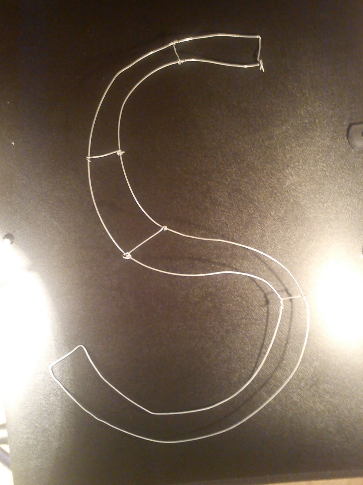
The first being how I wanted to explore outside the printed world. I wanted to send a happy random message to commuters outside of posters, billboards, etc. With this project I imagined a walking commuter, whether he or she was about to cross a street or maybe simply walking down the sidewalk to look up and find this wired word that said "SMILE." Why wire? Well because wire might tie into the urban scene more effectively, whether this be hanging from a the cross walk walking signal, or on a random Edinburgh iron fence, or a bus stop.


I'm almost embarrassed to mention just how long it took me to create this horrid looking 'S.' Let me just say much longer than it should have. *cough cough* (more than a days work). I assumed that taking that jewelry making class when I was 13 would have helped a bit when it came to bending and working with wire, but the truth is...I was far more talented with wire in my early teens than I am now. Though this is something I would like to explore more in the future, I had to make a decision: I don't have the time to perfect this at this time, especially when it's not something I'm really all that passionate about. Perhaps on free time, over break, when a deadline is not hanging in the back of my mind I could conquer this task - but not when there are other projects/subjects pending in my mind.

The second 'failed' project came from our Investigation Task with our tutor Jeanette. Well the idea came, but the fail came from my follow through. Our task was to look into [in a sense] symbols of our subject. We had to find or create images that match our subject to: Presentative, Metonymy, Synecdoche, and Metaphor/simile. The inspiration came when Sofia and I were trying to come up with a simile to bus transport and I joked about it being that of a kangaroo - sit back, relax, enjoy the ride...you'll get to your destination. Like that of kangaroo's joeys sitting in their mother's pouches, just relaxing on the journey. A bus is like a kangaroo. We found too much joy in this, probably more than the average person should - but that could be from our lack of sleep and over working...you tend to get loopy.

We then thought how much fun it would be to create a bus campaign in form of a kangaroo, emphasizing comfort and relaxing. How often do you see that message in bus campaigns? Never...exactly! So I went to drawing...


Okay, it was getting there...but it hit me hard - there is no drawing a kangaroo and joey without seeing a phallic symbol. I understand sex sells, but this was just ridiculous. From here on out, I could not draw or trace a kangaroo/joey image without seeing a phallic symbol, no matter what position the kangaroo was in. Hopping, standing, laying down...nope! It was not going to work! Again faced with the issue of time, I do think this could work if I spent much time trying stylize the kangaroo/joey and make them not so realistic. But of course with this idea coming to me at the end of the semester, time is not my friend. So yet another project that could be pending.

Monday, 5 December 2011

No need to reinvent the wheel

1. Where has this semester gone? It only felt like yesterday when I was presenting to MFA/MA 1 students. 2. Why do the most inspirational ideas come to me at the end of the semesters? It's a conundrum I'm not a fan of, same with that of why are porcupines and hedgehogs so cute but have an anti-cuddling layer around them.

 What I'm trying to do is get public transportation commuters to enjoy the journey, not the destination. How similar is that to my postgraduate journey? Quite. I did a few brainstorming exercises and the word that kept popping up was 'wheel.'

The wheel was invented to transport heavy objects from one location to another; of course in the early to late Neolithic era, I doubt such 'heavy objects' were people. In any form of transport today, this is what we rely on. We rely on the action of an axle overcoming friction to produce a 'rolling' motion, to get us to our destination. But take away the mechanics of a vehicle, the invention of a car, go back to the beginning. The origin. While we're on our journeys, it's the essence of the wheel that moves us. Gets us to where we need to be.

There is no arguing that the current Lothian bus pass design is obnoxious - it is busy, has bright obnoxious colours and by no need encourages a message of joy. Rather it encourages commercial work for Lothian buses. That boggles me, if someone has already purchased a bus pass, why advertise to them more? Clearly they are already going to be riding on the bus more, due to this purchase so there is no need to send a vibe of BIG BRIGHT LOOK AT US!


Now at this moment, feel free to tease me about my photo. In my defense, it was pouring down rain that day and I had no intention of looking good...but yes, moving on.

I got excited over the idea: what if I owned a bus company and I was to design for myself - what would it look like? I went through many designs, often it looked like someone threw up on my Illustrator artboard.


Many ideas popped up incorporating the theme of the wheel, but also working as best as I could to keep a clean cut feel, oh how that's hell for me.


The idea I finally settled on combined a simple wheel feel with that of a cool blue relaxing idea.

The logo was taken from the similar geometric objects found in my earlier helvetica explorations. The text on the back says: "Research has proven that human touch improves pulmonary function, reduces stress, lowers blood glucose and improves immune function. So next time someone bumps into you on the bus know you're better for it." Cheeky? Probably.

The hand was a random thought that popped into my head. Something for bus commuters to use and WAVE to car commuters. When they're at a traffic signal, of course. Don't want to cause an accident. On the back of the hand, it says: Sit back, relax, enjoy the ride.