I'm not always a fan of using the word 'fail,' I hope that fail could be replaced by 'pending' projects. The truth is, I do think it is vital to document your successes along with projects that don't quite work out. Here are two examples of such.
The first being how I wanted to explore outside the printed world. I wanted to send a happy random message to commuters outside of posters, billboards, etc. With this project I imagined a walking commuter, whether he or she was about to cross a street or maybe simply walking down the sidewalk to look up and find this wired word that said "SMILE." Why wire? Well because wire might tie into the urban scene more effectively, whether this be hanging from a the cross walk walking signal, or on a random Edinburgh iron fence, or a bus stop.
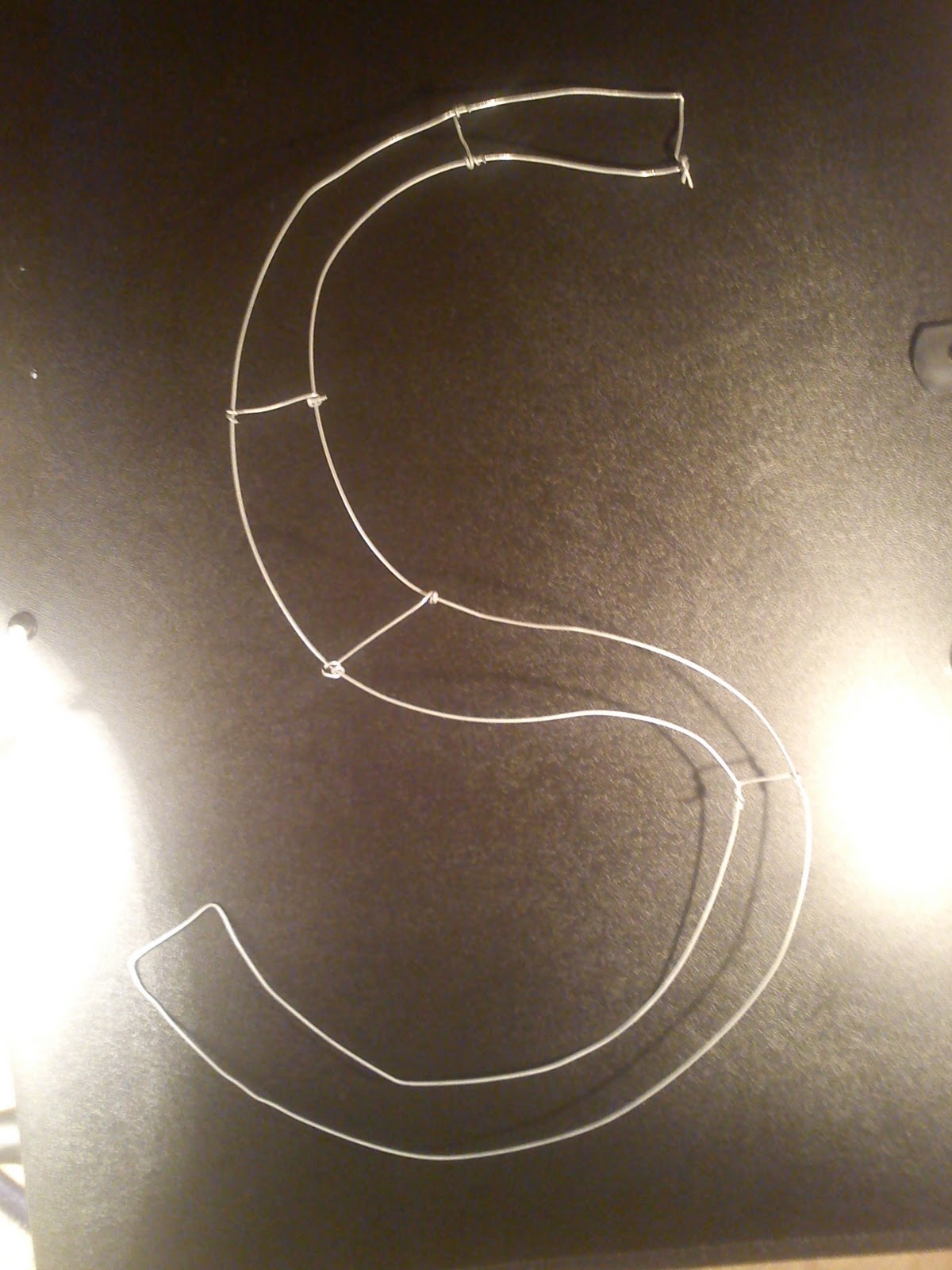
I'm almost embarrassed to mention just how long it took me to create this horrid looking 'S.' Let me just say much longer than it should have. *cough cough* (more than a days work). I assumed that taking that jewelry making class when I was 13 would have helped a bit when it came to bending and working with wire, but the truth is...I was far more talented with wire in my early teens than I am now. Though this is something I would like to explore more in the future, I had to make a decision: I don't have the time to perfect this at this time, especially when it's not something I'm really all that passionate about. Perhaps on free time, over break, when a deadline is not hanging in the back of my mind I could conquer this task - but not when there are other projects/subjects pending in my mind.
The second 'failed' project came from our Investigation Task with our tutor Jeanette. Well the idea came, but the fail came from my follow through. Our task was to look into [in a sense] symbols of our subject. We had to find or create images that match our subject to: Presentative, Metonymy, Synecdoche, and Metaphor/simile. The inspiration came when Sofia and I were trying to come up with a simile to bus transport and I joked about it being that of a kangaroo - sit back, relax, enjoy the ride...you'll get to your destination. Like that of kangaroo's joeys sitting in their mother's pouches, just relaxing on the journey. A bus is like a kangaroo. We found too much joy in this, probably more than the average person should - but that could be from our lack of sleep and over working...you tend to get loopy.
We then thought how much fun it would be to create a bus campaign in form of a kangaroo, emphasizing comfort and relaxing. How often do you see that message in bus campaigns? Never...exactly! So I went to drawing...
Okay, it was getting there...but it hit me hard - there is no drawing a kangaroo and joey without seeing a phallic symbol. I understand sex sells, but this was just ridiculous. From here on out, I could not draw or trace a kangaroo/joey image without seeing a phallic symbol, no matter what position the kangaroo was in. Hopping, standing, laying down...nope! It was not going to work! Again faced with the issue of time, I do think this could work if I spent much time trying stylize the kangaroo/joey and make them not so realistic. But of course with this idea coming to me at the end of the semester, time is not my friend. So yet another project that could be pending.
Showing posts with label communication. Show all posts
Saturday, 10 December 2011
Tuesday, 22 November 2011
I have an inkling...
2 colds/flus, 1 food poisoning, 1 sprained knee, 1 laptop crash has all equaled one hell of a semester. Perhaps I'm getting it all out this semester? That it's nothing but clear blue skies from here on out...here's to hoping!
Moving on, designing my pitch for the ECA Fashion Show was a great experience. The idea definitely progressed and developed much throughout the passed month - but the concept remained the same. The concept sprouted through the idea of fluidity found in ink and water, how fashion shows must remain fluid. It's one piece after another, it must continue and keep moving. There are no pauses, there is no stopping, keep going, keep moving, keep progressing.
From this I played around with photographing ink in water. I found it to be beautiful in the way that I had no control in the shapes made and created. It was a challenge I enjoyed.
Through this, my first design developed. High contrast between the bright orange and strong black. My idea for ticket would have been a postable 'perfume/ink' like liquid. Continuing with the concept of fluidity. After critique of this work, I was told that perhaps the ink looked a bit like 'bodily fluid' or something that could be found within one's body...something that perhaps isn't so attractive.
My next design consisted of changing the bright appearance of the orange ink and masking it through the black ink shape.
After I finished this revision, I had realized that perhaps Halloween was on my mind too much...seeing the colours and also how the 'Rorschach' mirrored effect made it look somewhat like a skull. Sinister? Perhaps. Again, the criticism of this revision was that it still reminded others of bodily fluids. At this point, I still didn't see it. After looking at it extensively, it appeared! From here on out, I couldn't look at this image without thinking, 'semen, semen, semen, semen...'
At this point I knew I still wanted to continue with the concept of ink in water and fluidity...but how can I do that without creating a design that looks like..well you get the point by now.
Having just read up on Gustav Klimt, my new design came alive.
I created a new image made from only 3 images of ink in water. I took geometric shapes from these images to create a new image. I fell in love with the contrast of ink being fluid and smooth, and these geometric shapes having hard edges, it was an ironic marriage formed. I started working on this image and worked the whole night through, it was after this night that flu #2 attacked me, I guess that's what lack of sleep does.
Details of the dress/body being made ^
Final design of the poster ^
Final design of the inside spread for the brochure, conveying a mirrored 'Rorschach' like concept. ^
And just as a sidenote: This should have been my first sign that my laptop was about to give way - Every time I hit save, this is what my image looked like as it was saving. Step one in how to give a graphic designer a heart attack...
Moving on, designing my pitch for the ECA Fashion Show was a great experience. The idea definitely progressed and developed much throughout the passed month - but the concept remained the same. The concept sprouted through the idea of fluidity found in ink and water, how fashion shows must remain fluid. It's one piece after another, it must continue and keep moving. There are no pauses, there is no stopping, keep going, keep moving, keep progressing.
From this I played around with photographing ink in water. I found it to be beautiful in the way that I had no control in the shapes made and created. It was a challenge I enjoyed.
Through this, my first design developed. High contrast between the bright orange and strong black. My idea for ticket would have been a postable 'perfume/ink' like liquid. Continuing with the concept of fluidity. After critique of this work, I was told that perhaps the ink looked a bit like 'bodily fluid' or something that could be found within one's body...something that perhaps isn't so attractive.
My next design consisted of changing the bright appearance of the orange ink and masking it through the black ink shape.
After I finished this revision, I had realized that perhaps Halloween was on my mind too much...seeing the colours and also how the 'Rorschach' mirrored effect made it look somewhat like a skull. Sinister? Perhaps. Again, the criticism of this revision was that it still reminded others of bodily fluids. At this point, I still didn't see it. After looking at it extensively, it appeared! From here on out, I couldn't look at this image without thinking, 'semen, semen, semen, semen...'
At this point I knew I still wanted to continue with the concept of ink in water and fluidity...but how can I do that without creating a design that looks like..well you get the point by now.
Having just read up on Gustav Klimt, my new design came alive.
I created a new image made from only 3 images of ink in water. I took geometric shapes from these images to create a new image. I fell in love with the contrast of ink being fluid and smooth, and these geometric shapes having hard edges, it was an ironic marriage formed. I started working on this image and worked the whole night through, it was after this night that flu #2 attacked me, I guess that's what lack of sleep does.
Details of the dress/body being made ^
Final design of the poster ^
Final design of the inside spread for the brochure, conveying a mirrored 'Rorschach' like concept. ^
And just as a sidenote: This should have been my first sign that my laptop was about to give way - Every time I hit save, this is what my image looked like as it was saving. Step one in how to give a graphic designer a heart attack...
Labels:
art,
communication,
design,
fashion,
gustav klimt,
ink,
water
Monday, 7 November 2011
No guts, no glory
My challenge is to go beyond the media I'm used to creating. I know how to create printed material, I know how to communicate messages through any printed media.
But take away my printer, my laptop and I'm lost, it's like throwing someone into the deep end of a swimming pool - with weights around their ankles. Good luck!
To go beyond the printed world, the printed companion. How do you reach others? There's performance, there's drama. If I want to influence the minds of the average commuter, I have to branch out beyond the passive printed format. Does this scare me? Of course it does, I am no performer. I would much rather reach the minds of the average commuter by hiding behind my work, but really - no guts, no glory.
To change topics: Now let's focus on what has been my inspiration as of lately. I swooned over the typography found in Lacoste Legends, it's newspaper and it's beautiful. Stunning type. It's artistic yet draws your eye in, makes you want to look closer.
http://www.behance.net/gallery/Lacoste-Legends/1432521
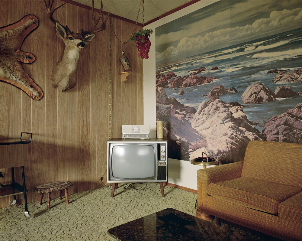
To make the ordinary 'less ordinary,' I asked for some inspiration from my sister who happens to be a photography teacher, and therefore has a bit more insight into similar photographers. Her recommendations: Garry Winogrand, Stephen Shore (Uncommon Places) and Robert Frank
(The Americans.
Garry Winogrand did a series called Women are Beautiful. These are simple images capturing the average woman in the street, I feel they are stunning to the eye. These women aren't posing, they're captured in their everyday life and I smile because of it. They are beautiful:
Stephen Shore:
Robert Frank, The Americans: Of course I would swoon for these. It captures the essence of that time, that era. I swoon for the simple everyday beauty, now how do I get others to do the same? How do I do like them, capture the beauty and express the beauty?
But take away my printer, my laptop and I'm lost, it's like throwing someone into the deep end of a swimming pool - with weights around their ankles. Good luck!
To go beyond the printed world, the printed companion. How do you reach others? There's performance, there's drama. If I want to influence the minds of the average commuter, I have to branch out beyond the passive printed format. Does this scare me? Of course it does, I am no performer. I would much rather reach the minds of the average commuter by hiding behind my work, but really - no guts, no glory.
To change topics: Now let's focus on what has been my inspiration as of lately. I swooned over the typography found in Lacoste Legends, it's newspaper and it's beautiful. Stunning type. It's artistic yet draws your eye in, makes you want to look closer.
http://www.behance.net/gallery/Lacoste-Legends/1432521
To make the ordinary 'less ordinary,' I asked for some inspiration from my sister who happens to be a photography teacher, and therefore has a bit more insight into similar photographers. Her recommendations: Garry Winogrand, Stephen Shore (Uncommon Places) and Robert Frank
(The Americans.
Garry Winogrand did a series called Women are Beautiful. These are simple images capturing the average woman in the street, I feel they are stunning to the eye. These women aren't posing, they're captured in their everyday life and I smile because of it. They are beautiful:
Stephen Shore:
Robert Frank, The Americans: Of course I would swoon for these. It captures the essence of that time, that era. I swoon for the simple everyday beauty, now how do I get others to do the same? How do I do like them, capture the beauty and express the beauty?
Subscribe to:
Posts (Atom)